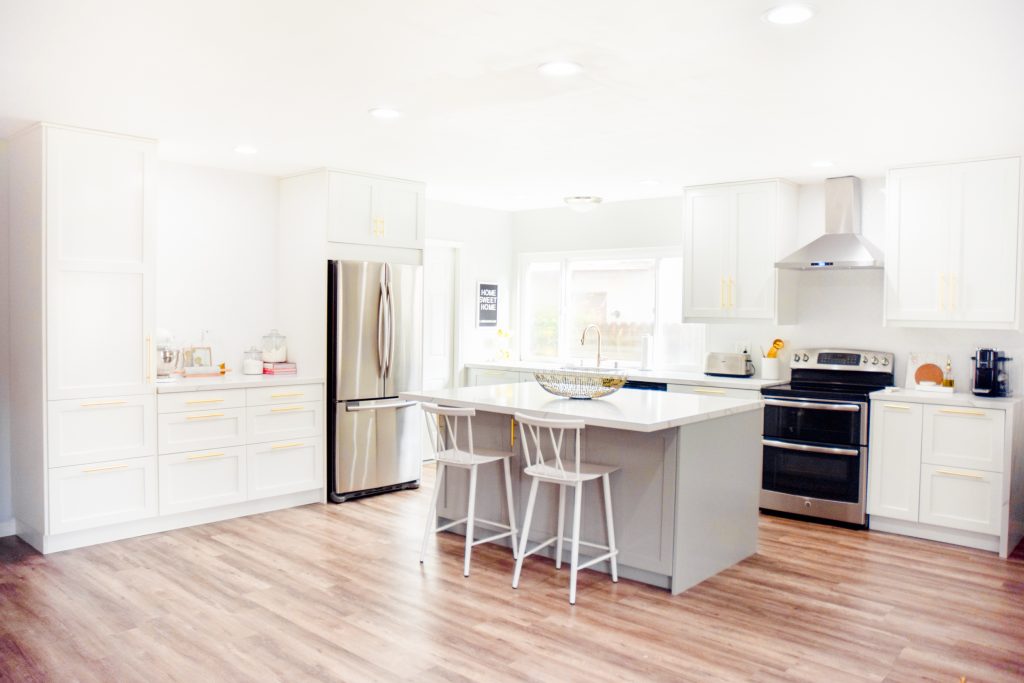
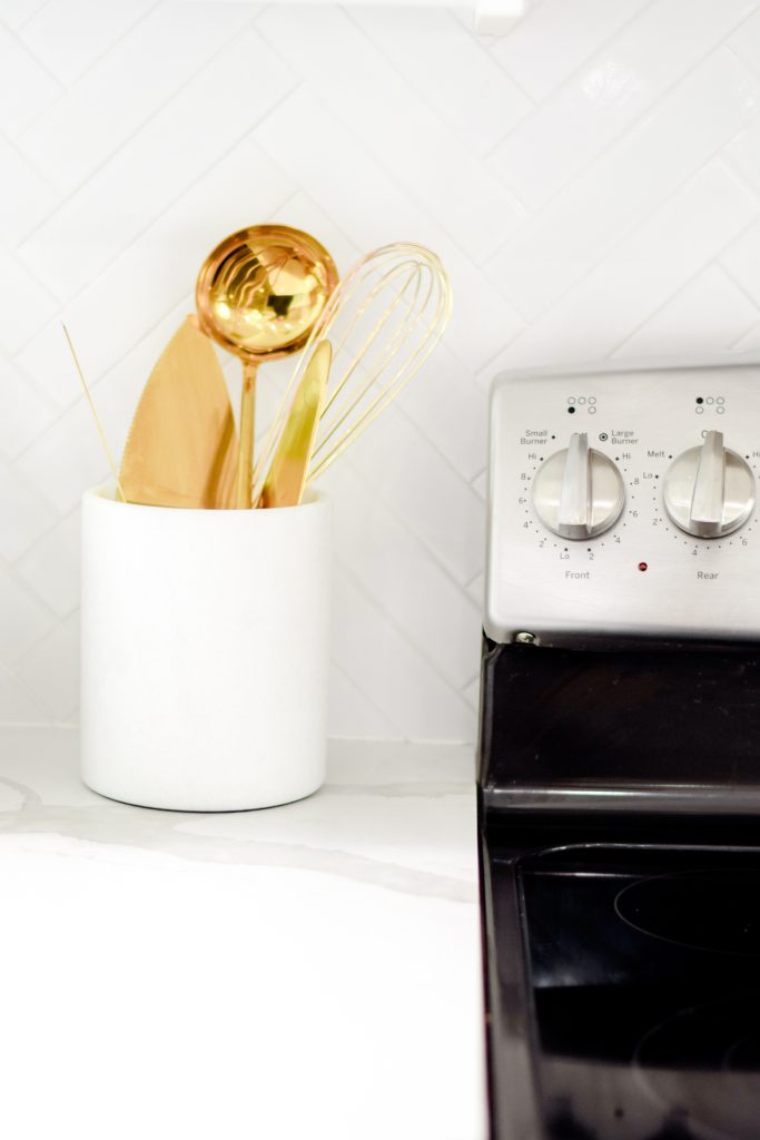
It’s finally here!! Our remodeled kitchen reveal! We moved in 5 months ago and started demolition and remodel immediately. The kitchen was by far the biggest undertaking in the entire house and it took quite a while. We finished the bulk of the renovation about 3.5 months in. The rest of the time has been spent styling and perfecting the space! Thank you guys for being so patient and waiting what feels like forever for this reveal. I absolutely love the way the kitchen came out and feel so lucky that we were able to complete the kitchen of my dreams in our very first home. I was very particular about what finishes I chose, where everything was going to be stored, and how the kitchen was going to function. I will go more in depth about the design process and how I’ve organized everything in future posts! Without further ado, here are all the photos of our gold and gray kitchen!
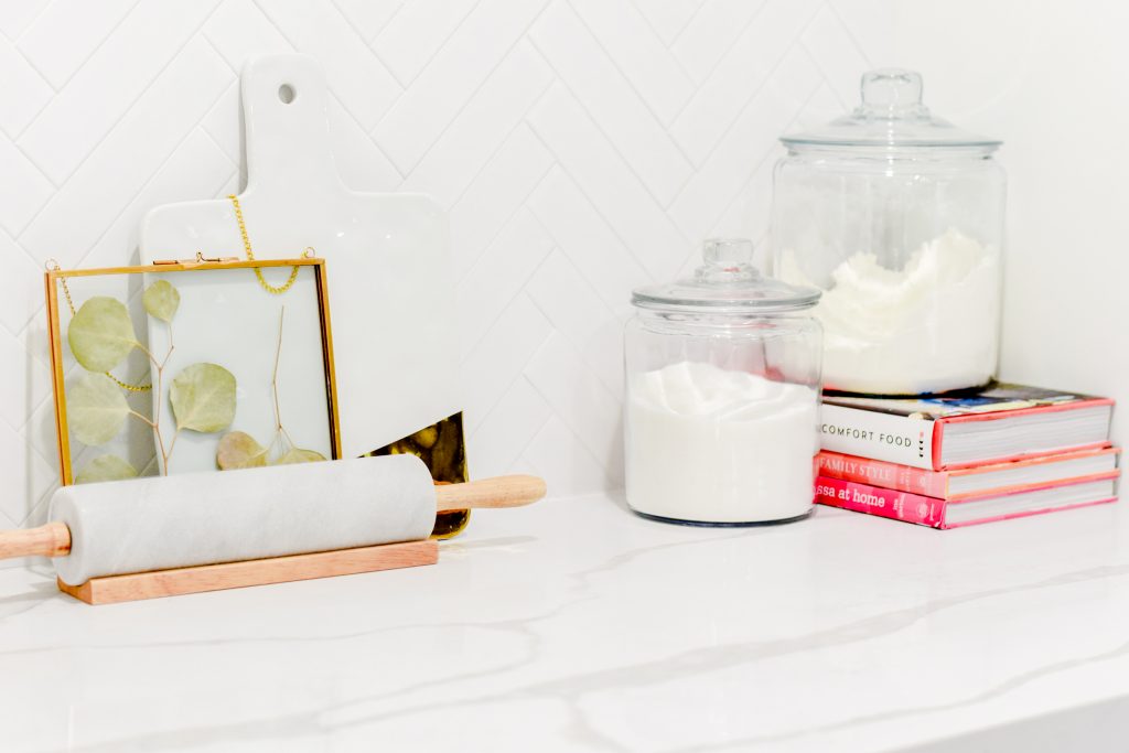
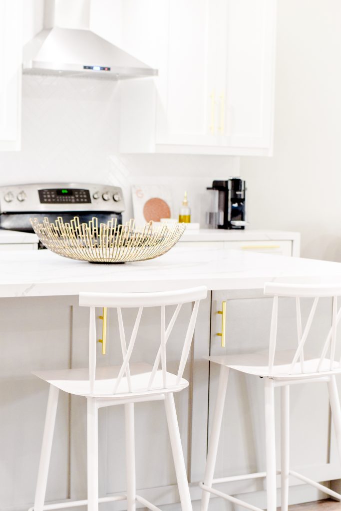 For countertops, I wanted the look of marble but definitely didn’t want marble. Marble is just too high maintenance and sensitive for my liking – it’s absolutely beautiful but I didn’t want something I’d have to worry about setting a glass down on. We opted for a quartz countertop by LG Viatera in the style Calacatta Alpha. This was a decision I absolutely agonized over – we went and saw 100+ options at a bunch of different shops and slab yards. I wanted whatever we chose to be perfect because it sets the tone for the entire kitchen and it’s not something that can be easily returned or switched out. That’s an expensive mistake to make if you don’t love it! Luckily, I am so happy with the Calacatta Alpha by LG Viatera. The look is exactly what I had in mind and it’s super durable. We are pretty hard on them and haven’t had any trouble with scratching, staining, or chipping. If there is every a particular stubborn mark, I give it a quick scrub with a Magic Eraser and it disappears immediately. Before starting the design, one of the things I was really hoping we would be able to incorporate was an island. I wanted one for a couple of reasons – they’re gorgeous, they add a ton of counter space and storage, and it would give us somewhere to store our microwave. I don’t see people have their microwave in their island very often and I don’t know why – it’s amazing! It keeps it off the counter and it doesn’t have to be the star of the show above the stovetop. My parents did this in their kitchen ages ago and it’s brilliant. My mom thinks of everything so naturally, I copy her every move. All we had to do was make sure we ran electricity to the island before installing it. I had the electrician install one outlet for the microwave and one outlet to plug in small appliances, like a blender or electric skillet. To make the second outlet accessible but still hidden, I had it installed on the inside of the middle cabinet, as close to the door as possible. That way I can plug something in and still close the cabinet door! This comes in especially handy when I make pancakes on the weekends. Also, for additional storage, I opted for 3 cabinets on the backside of the island. Since it’s covered by barstools most of the time, I use these to store things that we don’t use as often – party decor, holiday plates, etc.
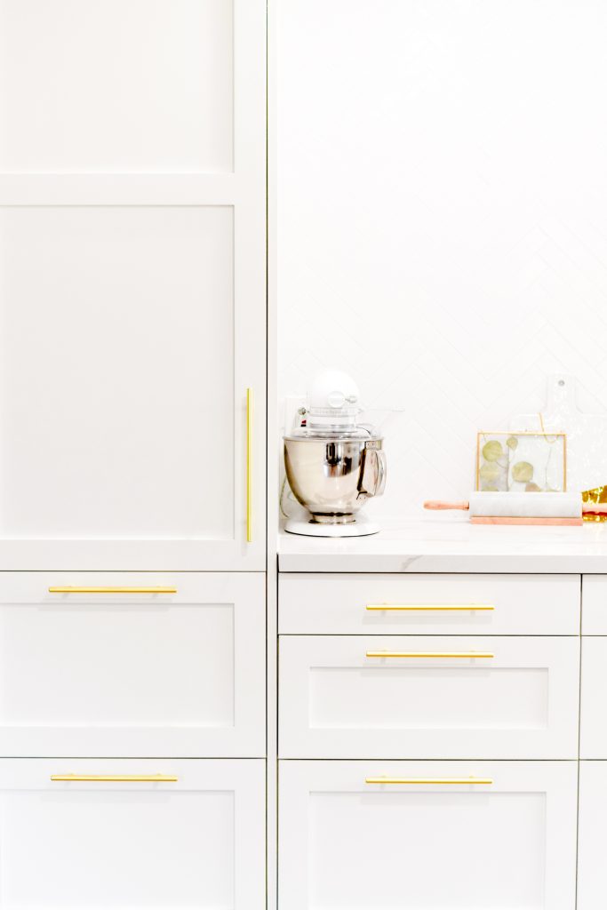
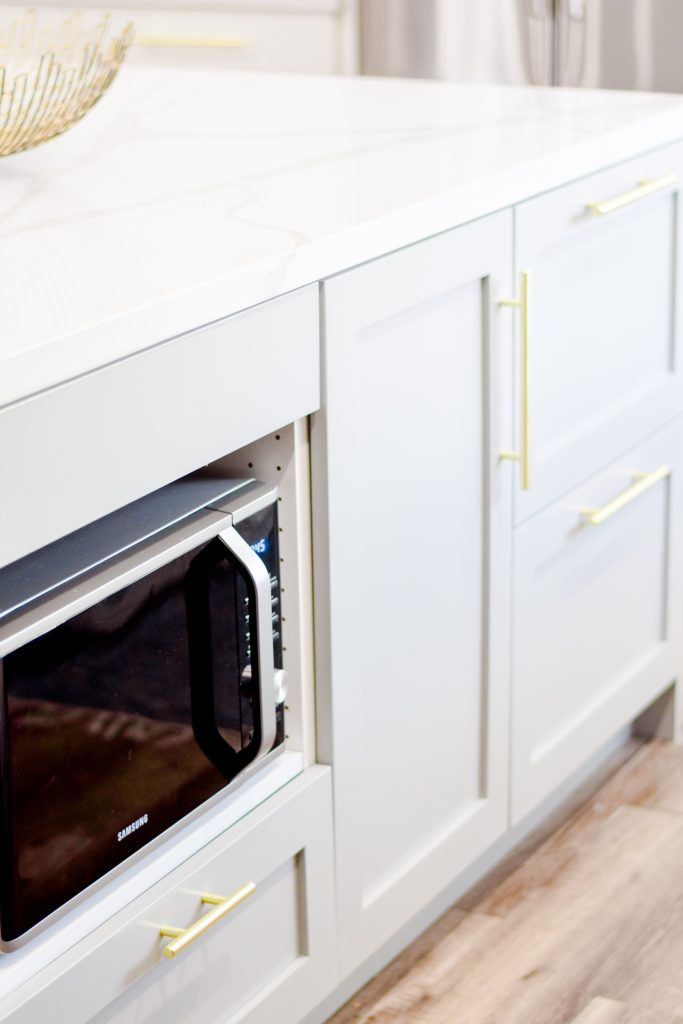
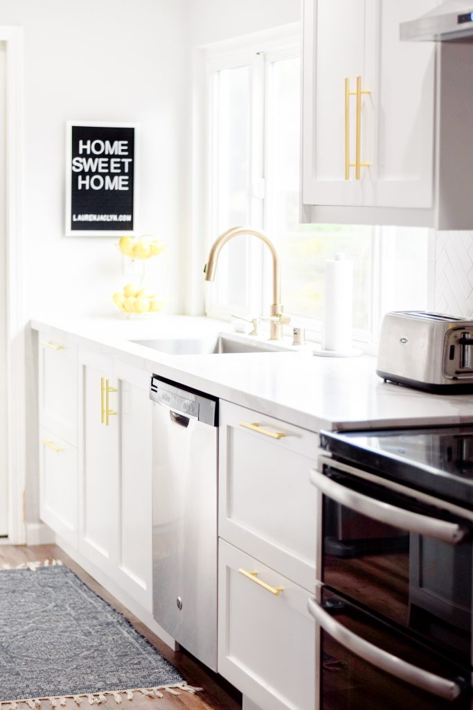
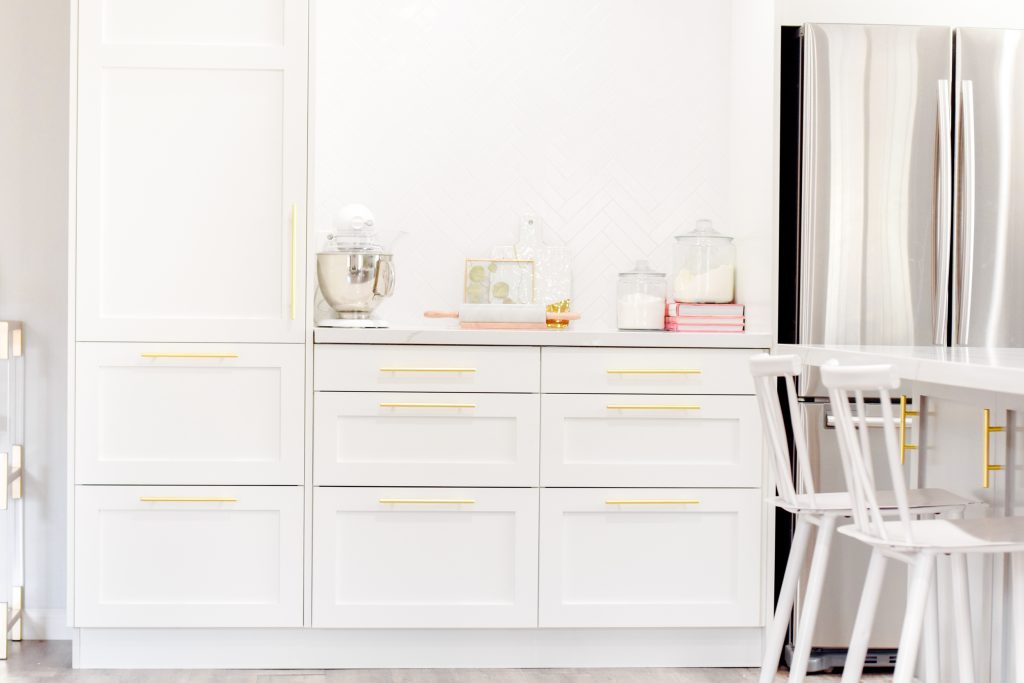
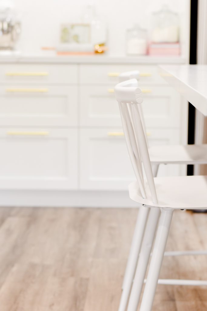
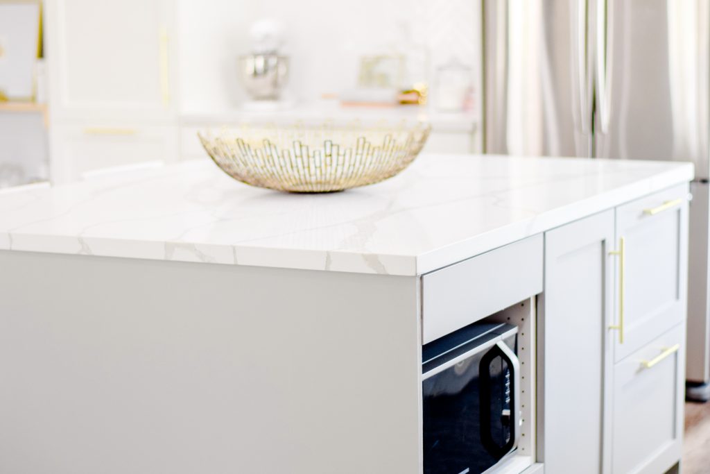 Another thing I was dead set on was gold hardware for all the cabinets and drawers! A lot of times, people treat hardware as an after thought but it can really make or break the space. Think of it as jewelry for your home! I found these pulls and I’m absolutely in love with them – the Satin Gold color is perfect, they come in a ton of different sizes, and they are super heavy. They feel really high end but they were actually the most affordable option I found! I used a 9″ pull for the tall pantry, 7″ pulls for all cabinets and drawers wider than 18″, and 3″ pulls for all cabinets and drawers smaller than 18″. I wanted the hardware to be substantial enough to make a statement but not so large that it overwhelmed the cabinets – these are exactly the proportions I had in mind. To coordinate with the hardware, I went with a gold kitchen faucet (and matching soap dispenser and air gap). The finish is called Champagne Bronze – it’s not an exact match with the cabinet pulls but it’s in the same family so I’m very pleased with it. We paired it with a 32″ undermount stainless steel sink that brings me so much joy it’s insane. Does this mean I’m officially an adult? Doing dishes is actually enjoyable in this sink, if you can believe it – it’s huge so I can fit all of my pots and pans in there without a problem. It’s a far cry from our old tiny square sink we had in our old rental.
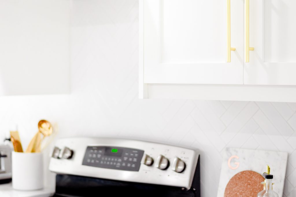
 Our kitchen before the remodel had a very strange layout – the wall with the sink and range was essentially the same but the fridge was located directly across from the range, right next to a makeshift pantry. It made the kitchen super crammed and inefficient. We knocked down that wall (along with 3 others in this space – can you even picture that?!) and it gave us an almost completely blank slate to work with. We added all the cabinets on the east wall and made a functional space for the fridge. To counteract the heaviness and height of the fridge, I added a ceiling height pantry on the left. This added a ton of storage while also balancing out the space. I didn’t want more wall cabinets on this wall because I wanted it to be open and airy. This gave us the opportunity to have a backsplash moment – we did a custom herringbone backsplash from countertop to ceiling. The tiles are a 1.75″ x 7.75″ porcelain subway tile – I’m obsessed with the long, thin shape as opposed to the traditional subway tile. The elongated shape combined with the tone-on-tone white grout gives a more contemporary feel that I love! I made this entire area into a dedicated baking space – we store our KitchenAid mixer, jars of flour and sugar, and rolling pin on the counter. All of these drawers contain mixing bowls, measuring cups, and all the baking fix-ins. It’s so convenient to have everything within arm’s reach; I find myself baking a lot more often, which I’m not sure is a good thing!
Paint Colors:
Walls | Sherwin Williams – Big Chill
White Cabinets | Sherwin Williams – Extra White
Gray Island | HGTV by Sherwin Williams – Essex Gray
Shop My Kitchen:


Such a gorgeous kitchen Lauren! I would expect nothing less than this from you. The little styling details are magnificent and the architectural touches are perfection!
XOXO
http://www.xoxodaniellemone.com
That’s so sweet! Thank you so much!!
Xx
Kitchen goals down to every little detail!
Thank you so much!
Xx
Beyond beautiful! It is perfect and very elegant. I love it and can’t wait for all your beautiful ideas in out kitchen.
Thank you so much, Mari! I cannot wait – it will be such a fun project!!
Xx
Wow!!!!! You’re amazing! Your kitchen looks like it belongs in a magazine…gorgeous!
You are so sweet, Mayra! Thank you so much!
xx