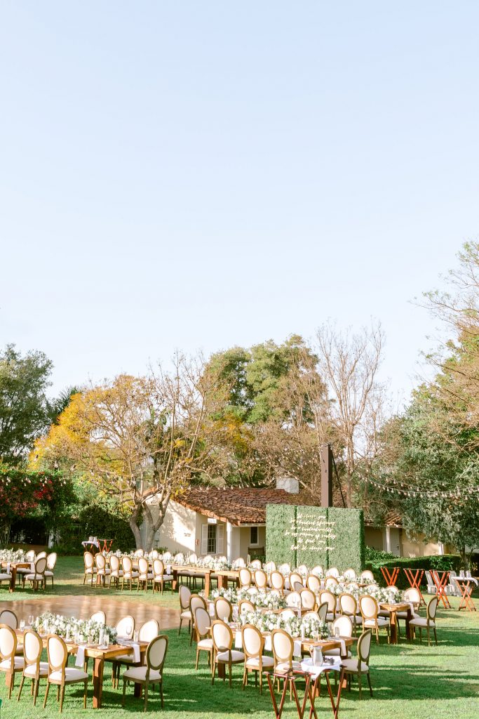
It’s finally time to dive into all the little details of our wedding day! I have been waiting soo long to share these special touches with you all. Thank you for your endless patience! The truth is, it’s a combination of two things: 1. me waiting for publications to pick up the photos so that my incredible teams of vendors could get features and credit for their work (our wedding has been featured on Style Me Pretty and Martha Stewart Weddings, twice!) and 2. just letting time get away from me. Luckily, although we just celebrated our 1 year anniversary (how is that possible?!?), the day still feels like it was yesterday so I haven’t forgotten a single thing. Stay tuned for more wedding posts – I am going to be breaking down every detail of the entire day in the next few weeks!
I truly enjoyed the process of wedding planning so much, from start to finish, but my absolute favorite part was being able to add these special touches throughout the experience and decor. Being able to customize the day so that it just felt like us was crucial and every single one of these things played a role in that. If you’re in the process of planning, my advice to you would be to add specialty items that really speak to you and your spouse as a couple. Even if it’s just something small that only the two of you know is there, it’s going to make the whole day feel that much more personal. And chances are, your guests will notice and love that the wedding was a representation of you.
Laser Cut Signage and Quotes
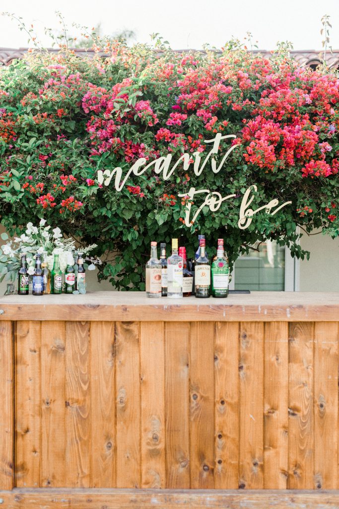 I’ve been swooning after laser-cut signage for as long as I can remember – it’s sprinkled all over my Pinterest boards. When it came time to plan the wedding, I knew this was a must. It’s elegant, striking, and so customizable – you can do any words, fonts, or colors you choose. They can literally be incorporated into any event. I worked with Lindsay from TheConfettiHome and she was beyond amazing – so creative, talented, and patient. She and I worked together via email to create all of the custom laser cut signage and it turned out better than I could have imagined. She is so attentive to detail and quality and truly has an eye for this type of design. Highly, highly recommend her for all of your custom signage – I know you’ll love her as much as I do! The very first thing that inspired me was the idea to have “meant to be” hung somewhere throughout the decor. This particular phrase was a no-brainer because Andrew and I have been saying this to each other for nearly a decade now. When we used to pass notes in high school, we used to sign each one “MTB,” short for “meant to be.” Since then, it’s evolved into our own personal “jinx – you owe me a soda.” Whenever we say the same thing at the same time or come up with the same idea, we both yell “MTB” and it always brings a sweet sense of nostalgia. We had this “meant to be” sign made and hung behind the bar on the stunning wall of bougainvillea. It made a statement and meant something extra special to us and those closest to us. After designing that piece with Lindsay from TheConfettiHome, I knew I needed even more of these stunning signs. She created two more signs for me – one saying “donuts” and one saying “artist” to label different stations at the reception. It was the perfect elegant way to point people in the right direction, all while being cohesive with the design.
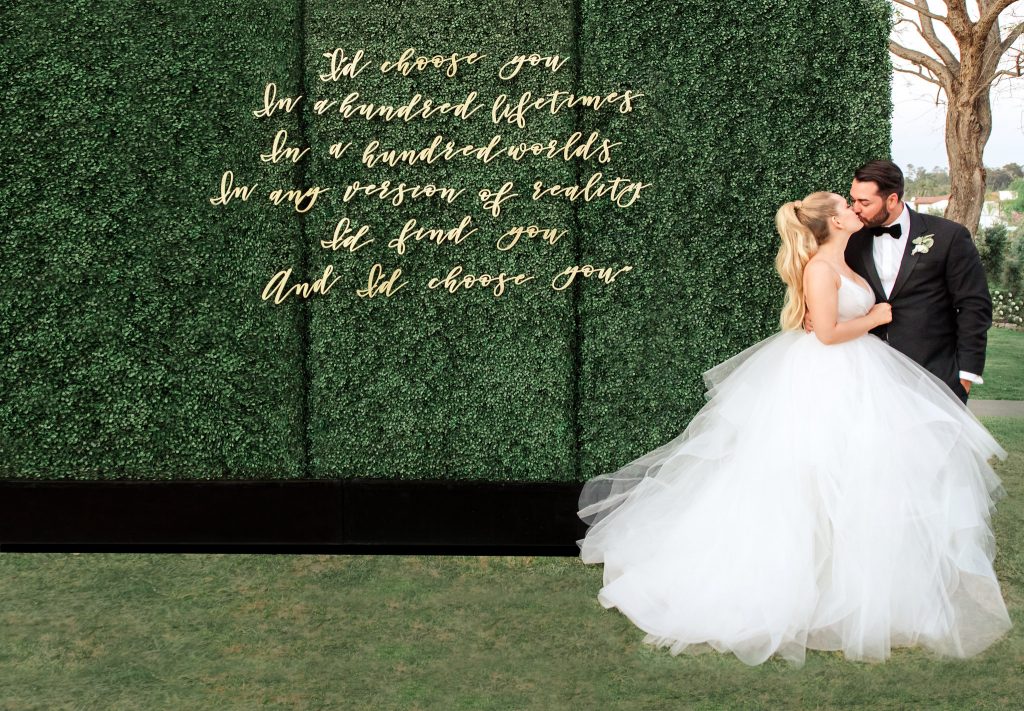
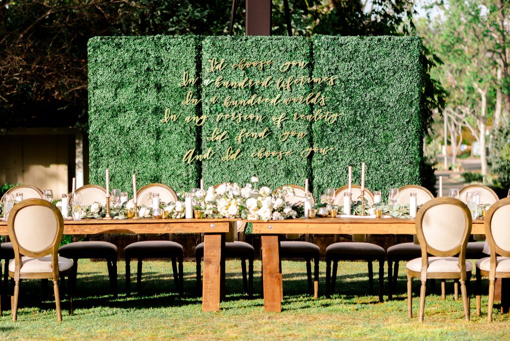 The last piece I designed with Lindsay from TheConfettiHome was arguably my favorite part of the entire wedding decor. It was actually not part of the initial design at all but I am so, so glad we included it. Essentially, we were going to light the giant oak tree behind the head table and it just wasn’t working. It was going to be too expensive and probably not make a huge impact anyway so we nixed it. I chose to do a wall of boxwood hedges instead to define the space and give a gorgeous backdrop. Since I didn’t want it to be bare, I took one of the quotes that was going to be read at the ceremony and had it laser cut into this stunning quote backdrop. It became to focal point of the entire reception design and was the perfect place for people to take photos throughout the night. Pro-tip: Since I wanted to be sure people would be able to get the entire quote in one picture, I measured out a 12 foot wide by 8 foot tall wall (to imitate the size of the boxwood hedges) in my home beforehand. I took photos on my iPhone, stepping farther and farther back, until I was able to fit an entire 12×8′ wall in 1 photo. Then I measured how far away I was standing from the wall and made sure to tell my coordinator that the boxwood hedges needed to be at least that far behind the head table. This would give people enough room to sneak behind the table and use the hedges and quote as a photo backdrop, without cutting off any words. Psychotic? Maybe. Effective? Definitely.
Acrylic Pieces
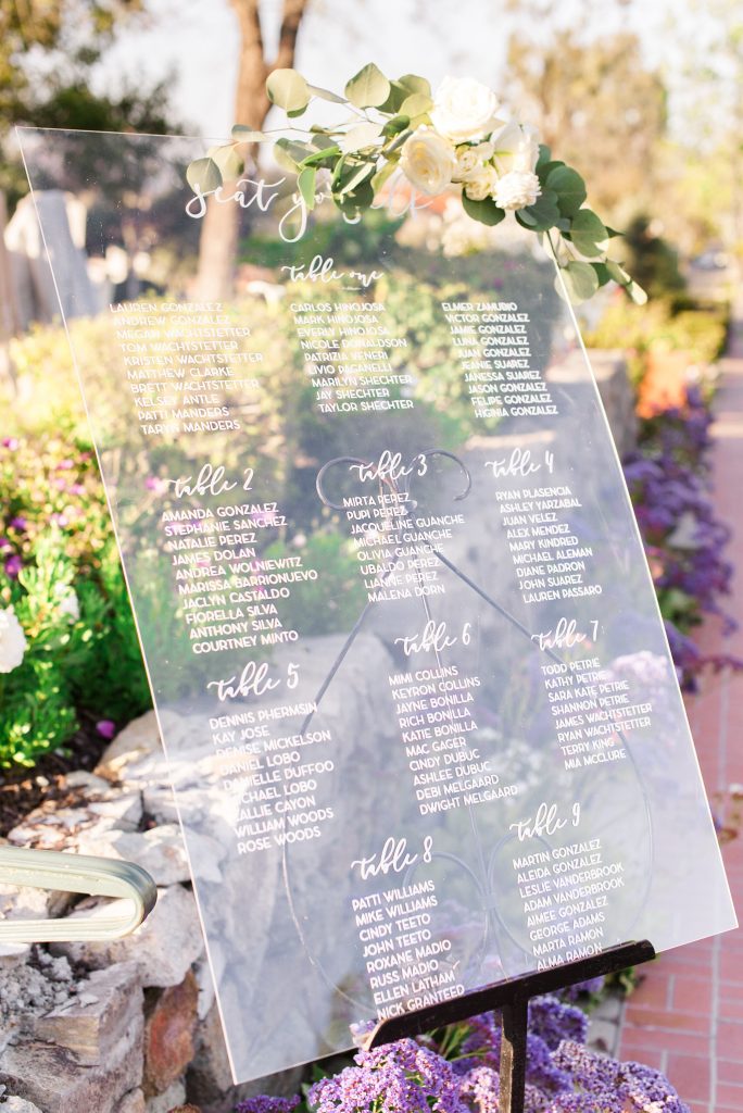 Throughout the design process, I wanted to be mindful of not going 100% with one single style. I wanted more of a mix of organic, raw materials paired with touches of glamour and modern pieces. Keeping things eclectic gave a much more well-rounded design that didn’t sway too far in any direction. To do this, I added in pieces of acrylic throughout to juxtapose the wooden signage and raw farm tables. I searched high and low for the perfect vendor and found Details, Darling and they killed it. The biggest project I had for the team at Details, Darling was the seating chart. Instead of having the traditional “find your seat,” I opted for the top to say “seat yo’self” as an ode to one of our favorite shows, Parks and Recreation’s “treat yo-self” episode. It was another one of those things that totally made sense to all the guests, regardless of the context, but Andrew and I were able to share an extra laugh about behind the scenes. Details, Darling also made all of the table numbers which paired perfectly with the floral garland runners, made by Blue Ladder Botany.
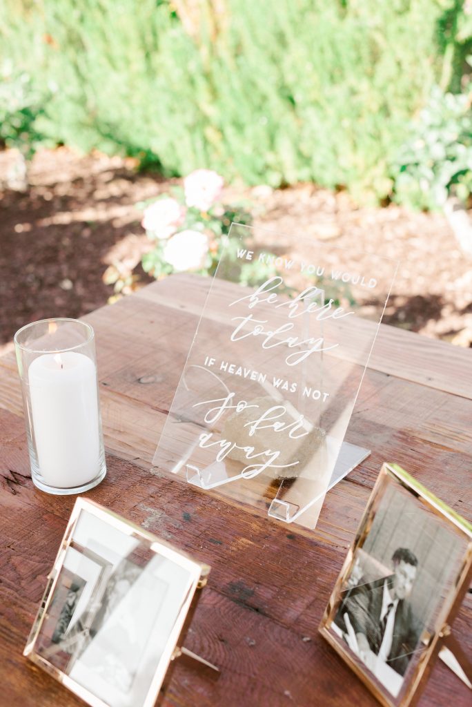
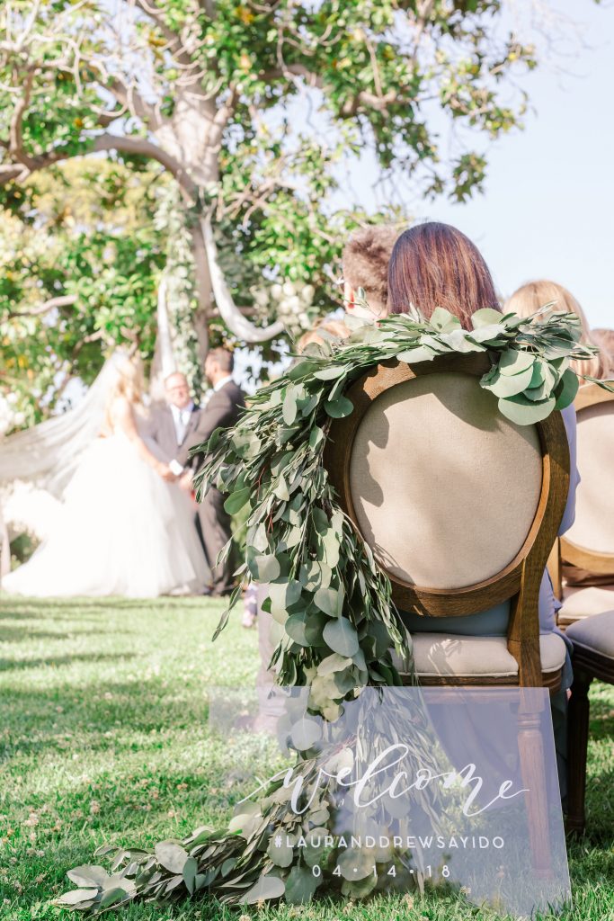 Another really special thing Details, Darling was able to create for us was the ceremony signage. We did a welcome sign, including our wedding hashtag so people knew what to hashtag their photos with, as well as a sign to ask guests not to use their phones during the ceremony, because what’s worse than getting back professional photos only to see all of your guests’ phones in the way? But the sweetest touch of all was a custom sign saying “we know you would be here today if heaven was not so far away.” We displayed this sign alongside photos of all of our loved ones that are no longer with us; we had Andrew’s grandfather light a candle to honor them and it was such an emotional, special moment for both of us and our families.
Watercolor Artist
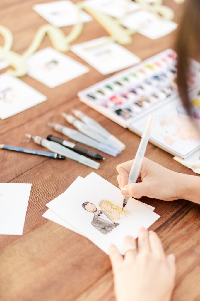
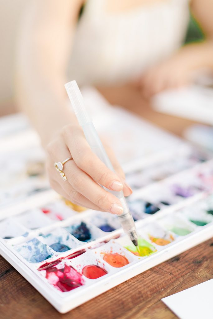
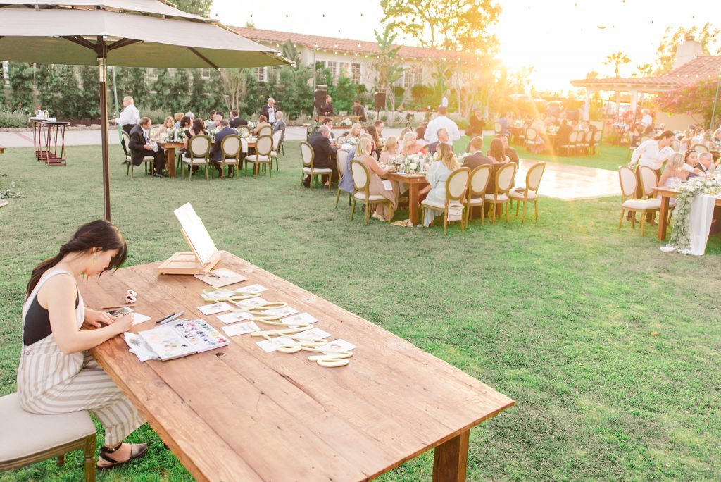 Years ago, I remember scrolling through Pinterest and seeing an acrylic painting being done on-site at a wedding ceremony. I made a mental note and never forgot it because I thought it was such a fun, unique idea! When the time came to plan our own wedding, I considered it but it wasn’t exactly what I wanted. Acrylic art isn’t really my thing – I prefer the soft, natural tones of watercolor. And I didn’t want a painting of our wedding ceremony because I knew it would be one of those things that I liked at first but would eventually end up in a guest room closet and never get looked at again. I cannot even tell you how long I searched for what I had in mind – I didn’t even know if it existed. After a ton of research, I finally found Dianuh from Chasing Linen and fell in love. And she just so happened to be local to San Diego – how lucky are we?! Her work was exactly what I had in mind, but better. She would be able to do custom portraits for each guest, on-site at the wedding. Guests had their photos taken on her iPhone and could then go pick up their watercolor portrait a few minutes later. It was the perfect keepsake and such a fun activity for the guests to be part of. So many of our guests have their custom portrait framed in their homes now, which I love! Pro-tip: Make sure to communicate exactly how many guests there are and be sure to hire the artist for enough time so that no one is left without a portrait. A couple of our guests didn’t get a chance to get theirs and that makes me so sad! This was one of the most unique things we had at the wedding and I am so glad we did it. Think of this as the most elevated, sophisticated, elegant caricaturist in history!
Hot, Fresh Donuts
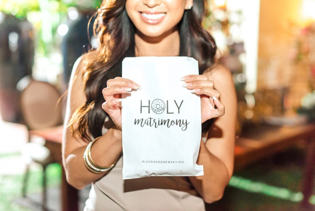
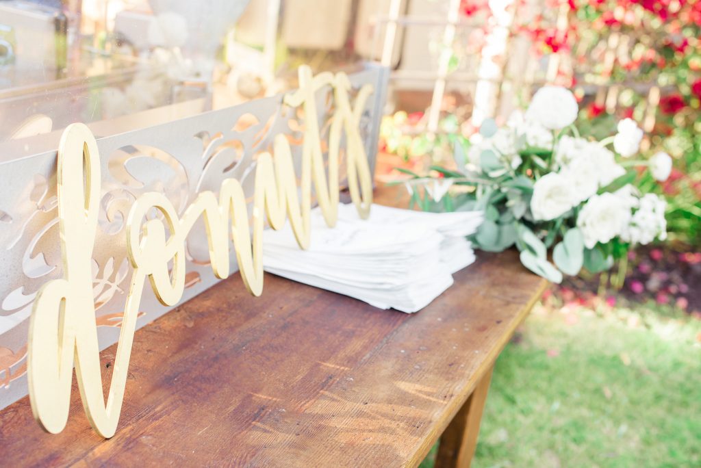 It wasn’t a huge surprise to anyone that donuts were going to be included at our wedding. I’ve been saying I was going to pass out Krispy Kreme donuts at my wedding since I was a little girl and this special touch by Sensational Treats was all of that and more! Since we both have an affinity for this dessert, I knew it had be included but didn’t want a donut wall or donut dessert table. First of all, they were getting to be too popular and I wanted something a bit more unique. And second of all, those displays always look gorgeous at first but once a few donuts get eaten, they look picked over and incomplete. I thought of having fresh donuts made on-site and served hot to the guests while I was at a doctor’s office one day – let’s take a moment to laugh at that, please – and immediately called my mom to share the idea. Let me set the scene for you: my mom is quite literally the most sophisticated person in the world, has more class in her pinky finger than most people on Earth, and doesn’t actually like any fried foods (where did I come from?!). So when I called her and was so enthusiastic, she was definitely less than thrilled at the idea of something carnival-esque being included in the wedding. Trying to be supportive, she said “well….maybe. But isn’t it going to smell like donuts?” My response? “UMM..YEAH. I hope so!” Long story short, she got on board and I found Sensational Treats, who made the display anything but carnival-esque. We had them set up at a gorgeous farm table, adorned with a floral garland, and a custom “donuts” sign by TheConfettiHome to keep it cohesive with the rest of the more formal design. The fresh mini-donuts were served in these custom bags by HHPaperCo that definitely added a level of sophistication to counteract the otherwise-casual snack. Seeing our guests dancing the night away with a drink in one hand and a bag of fresh donuts in the other truly made my heart soar. It was so perfectly us.
Venue – The Inn at Rancho Santa Fe | Photography – Charissa Magno Photography | Videography – Audrey Alba Films | Month of Coordination – Kelsey Rae Designs | Florals – Blue Ladder Botany | Chair Rental – APR Boutique Rentals | Flatware and Charger Rentals – The Chiavari Guys | Lighting and Boxwood Walls – Bright Event Rentals | Laser Cut Signage – TheConfettiHome | Acrylic Signage – Details, Darling | Placecards – BetterWeddingDecor | Cake – Laura Marie’s Cakes | Donut Catering – Sensational Treats | Donut Bags – HH Paper Co | DJ – Bryan Thrane at Pacific Entertainment | Acoustic Guitarist – Austin Ellis | Officiant – Vows from the Heart | Watercolor Artist – Chasing Linen | Wedding Dress – Hayley Paige “Chandon” gown | Bridal Shop and Alterations – The White Flower Bridal Boutique | Bridesmaid Dresses – Show Me Your Mumu | Hair – Tommy Tisso | Makeup – Makeup by Kandice | Groom and Groomsmen Tuxedos – The Black Tux

Leave a Reply