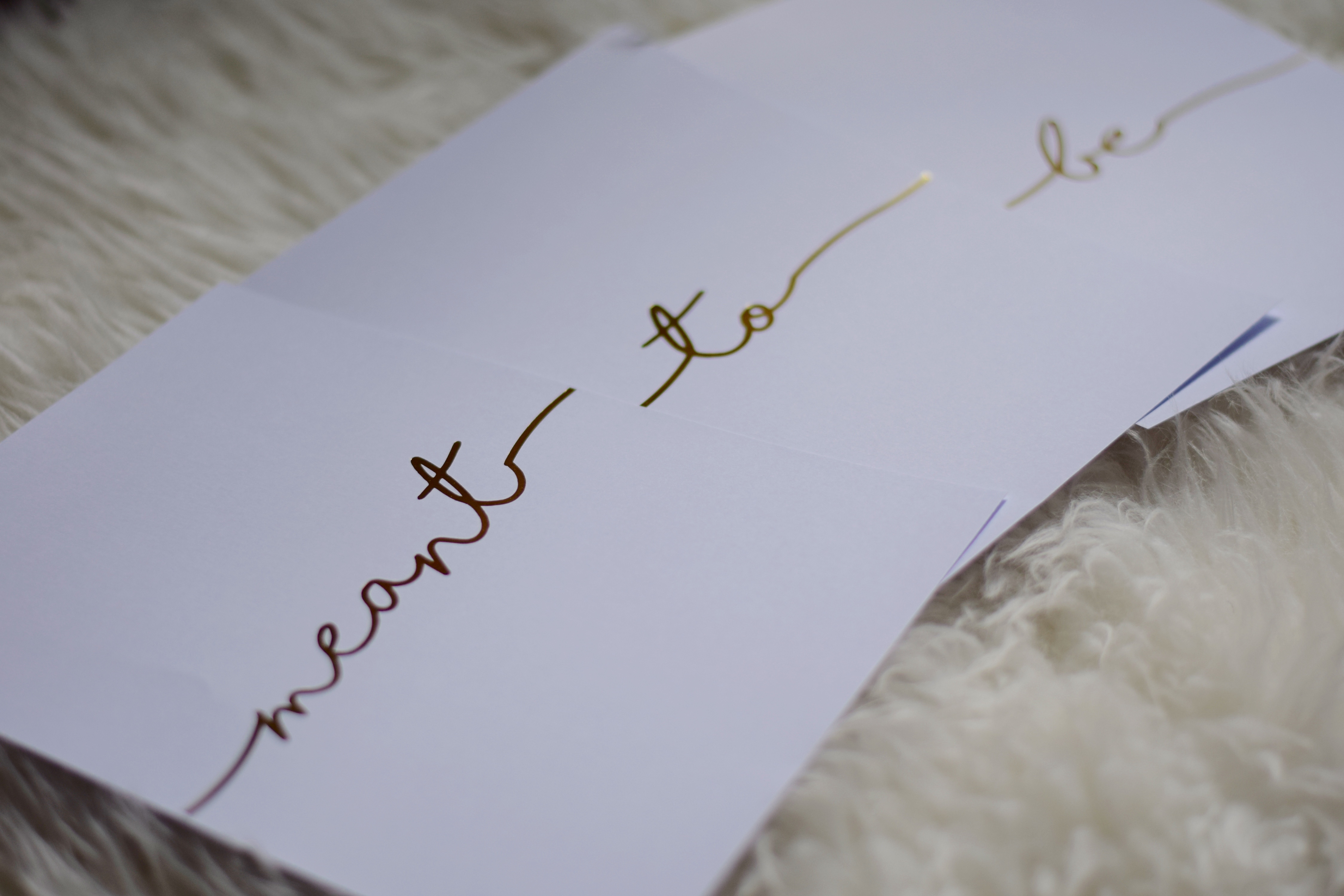
 I am so excited to share these beauties with you! I’ve been searching for the perfect piece of artwork for our living room basically since the day we moved in. I knew I definitely didn’t want something that was mass-produced or a cheesy print that you could pick up at any home store but I couldn’t find the perfect piece. Artwork can be a really special way to add a personal touch to a room without being overstated or obvious. For these prints, I definitely wanted something subtle that was meaningful to me and Andrew. This is our first home together and the artwork should represent that! The moment I laid eyes on the work of RM Print Co. on Etsy, I knew the search was over.
The Design Process
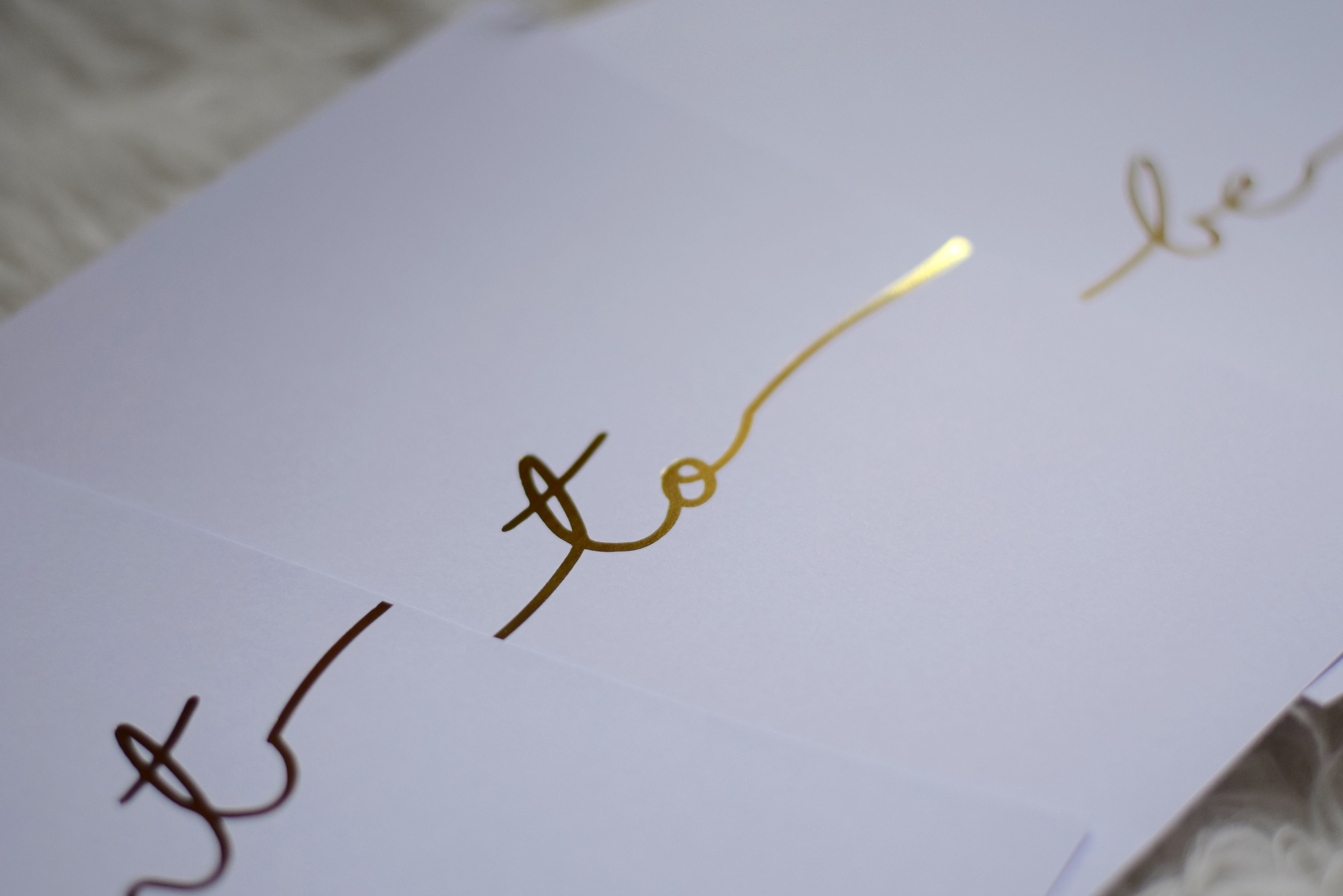
In our living room, I chose to keep things very neutral and added in touches of bronze and gold throughout to liven up the space. For the artwork, the one thing I definitely knew I wanted was gold foil. There is something so simple yet elegant about the art of gold foil – it’s dainty but makes a statement! For these prints, I collaborated with Ruth Mountford, the artist behind the designs, to create the final pieces. I used her existing prints as inspiration but chose a phrase that had meaning to me. We discussed dimensions and how I would display them and she did the rest! Such a pleasure to work with.
 The Back Story
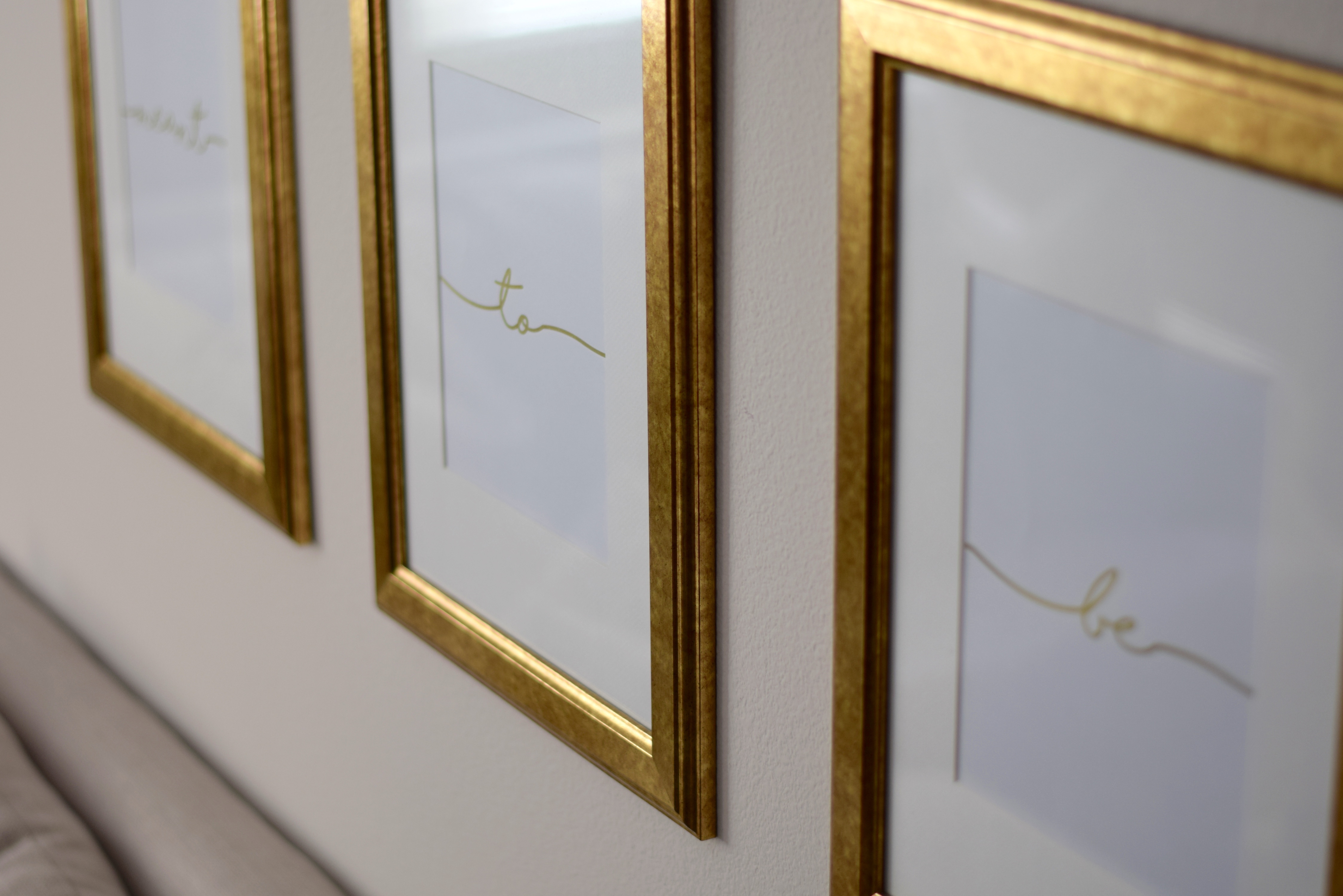
When Andrew and I were in high school, we used to write letters to each other using only acronyms and were somehow able to decode the entire thing in minutes, seriously. One of our favorite acronyms that we used to use was “MTB” to symbolize “meant to be.” We used this when we wanted the same thing for dinner or said the same thing at the same time and it’s stuck around all these years. Although I have definitely lost my touch in decoding acronym letters, we still say “MTB” in place of jinx and it reminds us of our younger years together. Since I had three available frames, this was the perfect subtle touch that only he and I would be able to decode, just like the old days.
 The Setup
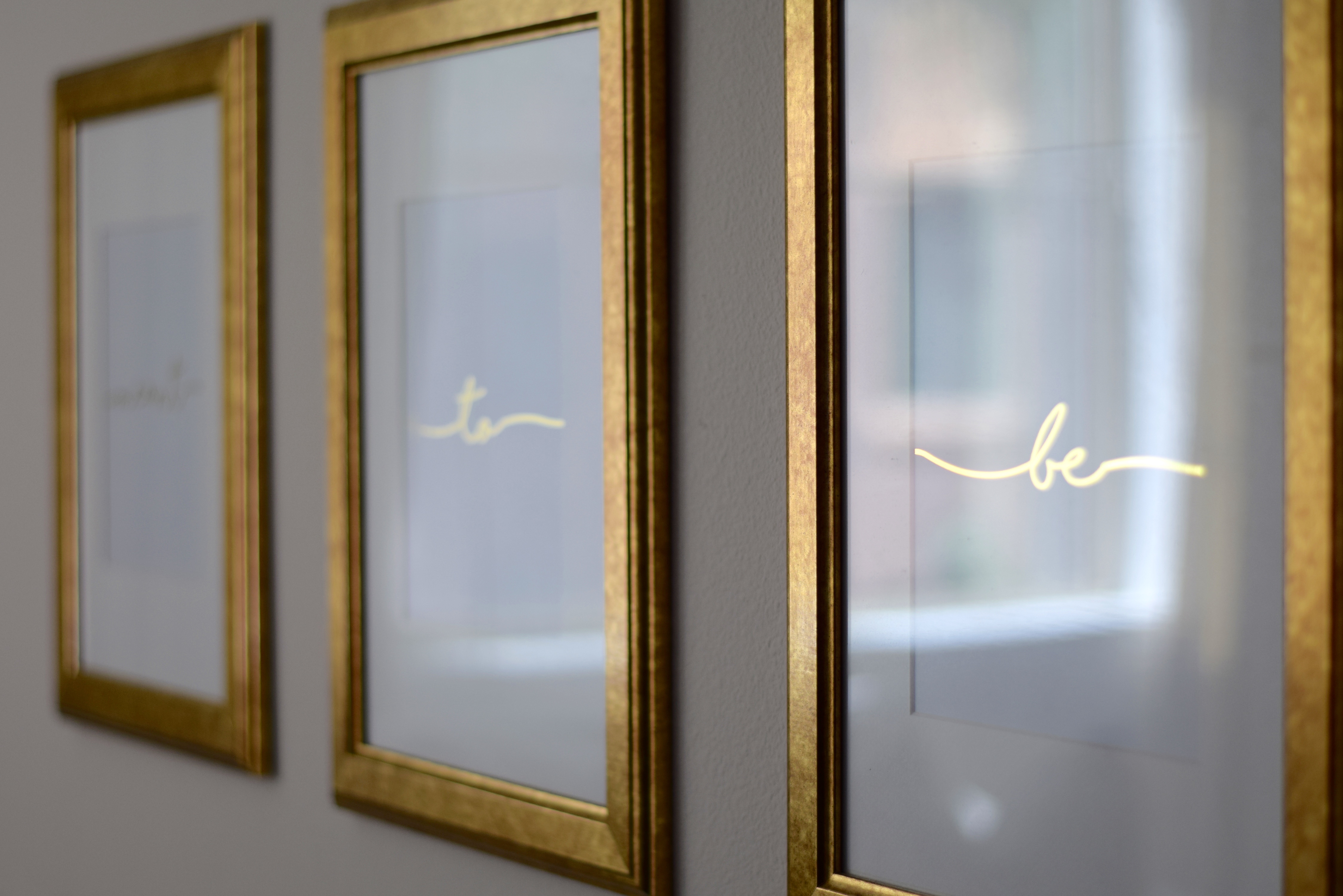
When choosing artwork to go above your couch, you should follow the general rule of thumb of at least 2/3 the width of the couch. In this room, I didn’t want a gigantic piece of art to overwhelm the space so I chose to do a uniform gallery wall instead. Although I opted for three different frames, I wanted the art to be some sort of set, whether they all connected literally or in theme. Since the final design choice was words, I wanted them to clearly connect to each other, as if it was one single print divided into three frames. Kind of like the DIY World Map project I posted previously! You’ll never guess where my favorite place to buy frames is! Drum roll, please. IKEA! Seriously, this is the best destination for frames because they have such a huge selection and they’re so inexpensive. Especially when you are doing a gallery wall and need a large amount, it’s a good idea to save on the frames! The ones I used are Virserum in 12×16″ – they are less than $10 each! Such an amazing deal. I hung them on the wall, about 8-9 inches above the back of the couch, and left about 3-4 inches between each frame. This allows them to take up visual space while still looking like a complete piece! Once I had the prints, I just popped them in and that’s it!
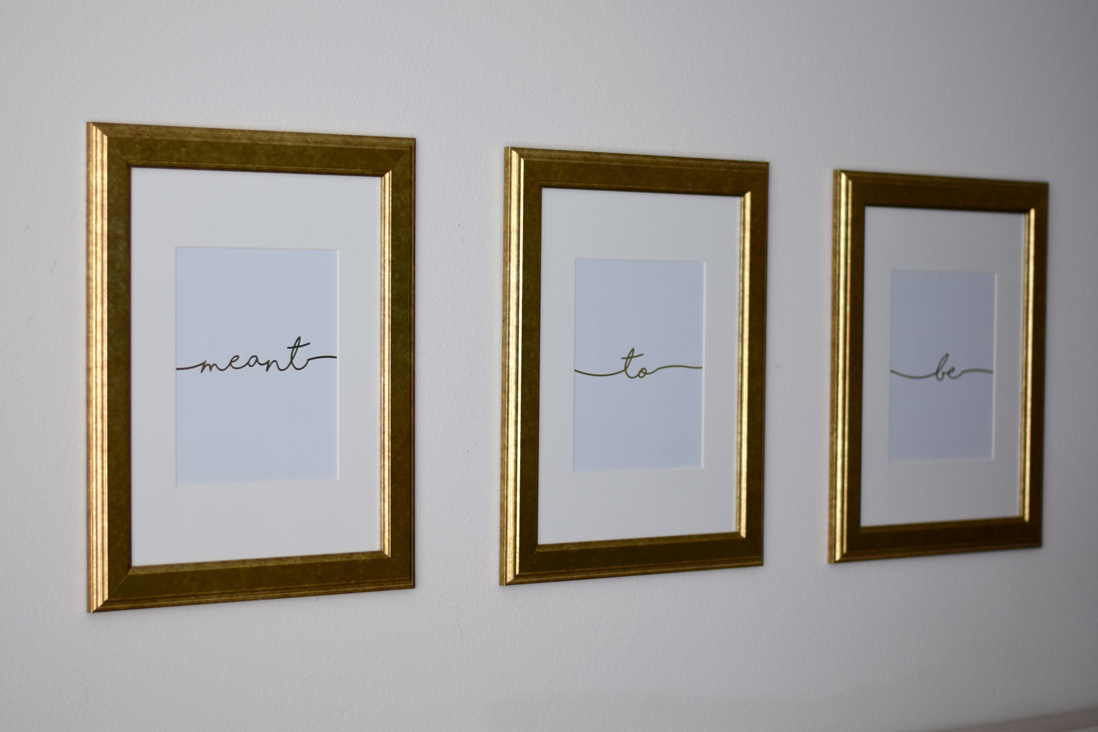 I am so happy with the way these turned out! We will have these forever and always remember they were part of our very first home together. Thank you so much to Ruth from RM Print Co. for collaborating with me and sponsoring this post. You definitely need to check out her shop! Ruth does beautiful handmade foil artwork for weddings, nurseries, and home decor. She also does custom pieces, like she did for me! Use the code LAUREN10 for 10% off your order!

Leave a Reply